The Medieval Manuscript collection is designed to showcase a range of texts and images over centuries of transmission, illustrating the art of the manuscript during the period of its greatest development and influence. Together, these images exemplify the cultural and historical contexts of literacy in the medieval period. Represented are Bibles, Books of Hours, and sermons, as well as other notarial and musical books, historical, philosophical, scientific, and theological books, among others.
Funded by a grant from the Andrew W. Mellon Foundation to the Five Colleges of Ohio (Next Steps in the Next Generation Library: Integrating Digital Collections into the Liberal Arts Curriculum, 2010)
-
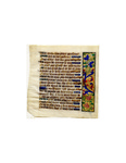
Book of Hours: Number 48
Unknown
Good condition, though the ink has faded slightly. Vellum is becoming warped.; Decorative flowers along the side of the writing.; Lettre de Forme; Several small historiated initials with thin gold writing on a blue background.; Floral images, very detailed. Some of the most careful and accurate drawings in the collection. The white flowers, in particular, were made with incredible care and skill.; Along left side of writing on verso and recto.; Clear in style and iconography. Very realistic, though the flowers are in an undefined space and too many types of flowers bloom from too few stems.; This manuscript is written in French, not Latin, that is rare for the collection.; Brown, gold, blue, red, green, pink, and white inks
-
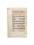
Gradual (Antiphonal?): Number 32
Unknown
The vellum is in poor condition and the black ink has begun to fade.; Many decorated initials.; Rotunda Gothic Script; The decorated letters here are particularly well done. Again, simple rubricated letters are enlivened by thin filigree. Ege notes that the writing is unusually well done and that this may be a result of competition with the printing press. This is a revival of an older style of writing.; Black (faded, now looks brownish, but on the other manuscripts in better condition the color is black), red, blue, purple, gold inks
-
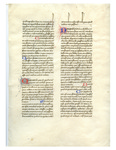
Dialogues of Gregory the Great: Number 41
Unknown
The vellum is in poor condition. There are several stains and the leaf has begun to warp.; There are several simply rubricated letters and several larger rubricated letters with thin designs around them. These designs are particularly beautifully made. On the recto there are dramatic ascenders on the top line.; Lettre Batarde. The first word of new chapters are done in Angular Gothic script.; The Dialogues of Gregory the Great, mainly autobiographical, discussed the miracles of the early Church fathers. The handwriting is not the Gothic style that many other leaves in this collection are in, but a writing style that was more like the everyday writing at the time. This could be written faster, but still be quite beautiful. The ascenders are generally seen in legal documents. This distinct style is certainly a result of the content -- this book was an academic book, not a mass book. Despite the more "common" style, the manuscript was made with great care, the historiated initials are among the most intricate in Ege's "50 Original Leaves."; Grey, red, and blue inks
-
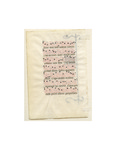
Hymnal: Number 21
Unknown
Good, small crease on verso and small stain on verso.; Decorative staff on verso and decorated "S" on verso. The hymn itself takes up little of the page, about half of the page is left blank. There is a small mark on the right side of the recto which says "in."; Angular Gothic Script (Italian Gothic Rotunda); "S" done in red, blue and white with a gold background.; Long staff with decoration, decorated letter "S." The background is done in gold leaf with a red band decorated with white filigree. The "S" is blue and is also accentuated by white filigree.; Along side of Verso; The staff is simple, alternating between red and blue with a white line going down the center and small detailing in gold. Ege tells us, "The simple pendant spear was used as a distinctive motif for not more than twenty-five years."; Considering the size of this manuscript, this hymnal was meant for a single person and solitary singing. The musical notation has only one part. Ege confirms this opinion, he writes "At important festival services such as Christmas and Easter these small hymnals were generally used by the laymen as they walked in procession to the various altars." The text is written in Latin. This is the 21st book of the 50 which Ege cut from and distributed around the country, other pages from the book are available at 39 other locations in the country, including Denison.; Black, brown, red, gold, blue, silver, grey lettering
-
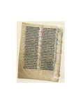
Breviary: Number 18
Unknown
Damage on the bottom right corner. The ink on the John the Evangelist illumination has smudged slightly. Nonetheless, all images and writing are still easily legible. Damage seems to be from dirt, presumably this book was used frequently.; Decorative staff on Verso as well as an illumination of St. John the Evangelist.; Angular Gothic Script. Ege notes the incredibly detailed work of the black letters, for instance, note the "O" next to the image of John the Evangelist, however, the rubrications are very simple and seem to be the work of a less skilled craftsman. This is unusual, normally the rubricator is the more skilled artist.; St. John the Evangelist with the body of an eagle -- the symbol associated with him.; This image is incredibly beautiful and intricate considering the size of the image -- barely three centimeters in any direction. Of the known images from this manuscript, this is the only one which has an image on it, which suggests that it is the first page of the book.; The Evangelist's face is left white and is accentuated by black lines. His face is young and angelic with curlicue hair, all traditional aspects of depictions of the Evangelist. His head then turns into the body of an eagle, and the tail of the animal decoratively wraps around the image.; On the Verso, there are two notations written, the style of their script suggests that they were written several centuries after the book was originally made.; It seems that some of the writing on the top has been cut off, it is possible that a small portion of the top was cut because of damage.; Black blue, red, green, white, brown, and gold inks
-
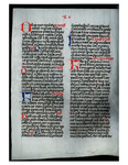
Missal: Number 49
Unknown
The vellum is very worn and there is damage on line 27 of Verso. The bottom line is strangely cut.; Decorative letters; Lettere Btarde, Erin Kathleen Donovan writes that it should be considered Gothic Rotunda Hand; There are some historiated initials, they are all very simple.; The writing in red ink was done at the same time as the other writing, in some cases it corrects or adds to letters, in other places it seems to be commentaries on the text. This page has not yet been translated or transcribed.; Ege tells us that this missal is rare because it is written on vellum, at this time most missals were made from parchment. On an unrelated note, the poor condition of the vellum may be from constant use, Missals were often kissed during Mass by the priest, this may explain why the manuscript is in worse condition than others in the set. Its use, as a book read by the priest during Mass, accounts for its large size; Black, red, and blue inks
-
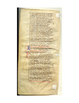
Aurora: Number 7
Petrus de Riga and Aegidius of Paris
Petrus de Riga and Aegidius of Paris created item, Riga died in 1209 and Aegidius completed it; Some fading and some creasing.; Several historiated initials with some decoration in thin filigree in red and blue.; Early Gothic Script; Black, blue, and red inks
-
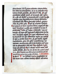
Missal: Number 2
Unknown
Vellum is in poor condition; Revived Carolingian Script, Erin Kathleen Donovan contradicts this however, she writes that the handwriting displays both Caroline and Gothic characteristics.; Several done in red and in a very simple style. Similarly simple rubricated letters are abundant as well.; Ege writes that this is probably from Spain, however he notes that it may be from Southern France. He found that it was similar in style to a manuscript commissioned by Abbot Gutterius in 1189 (who is Spanish), but notes that the writing is similar to manuscripts from France and England. Amy Vandersall claimed that this book was from Austria or Germany after looking at the leaf in University of Colorado's collection, but provides no evidence for this claim.; Black and red inks
-
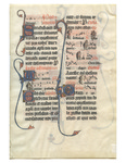
The Beauvais Missal: Number 15
Unknown
The vellum is worn, there is a small hole, which is probably a defect in the original animal's skin. According to Denison University, there is evidence that the manuscripts have been trimmed slightly. On ours, a small part of the decoration seems to have been cut at the top of the Verso.; Five Decorated letters on verso, four on recto; Italian Gothic Rotunda; T, B, M, M and S. All done in red and blue with floral like decorations in white and splashes of gold leaf. The backgrounds continue up and down the page making floral patterns.; Ege is particularly interested in the garden motifs here. Floral imagery is typically associated with later manuscripts. The University of Saskatchewan says about this, "The ivy suggests the text is like a garden, full of natural mystery and truth, to be entered and experienced by the reader."; The decoration of the letters is vine like and has leaves on their ends.; The Beauvais Missal is the most famous and the most elaborate of the manuscripts in Ege's collection. This was given to the Beauvais Cathedral as a gift from Robert de Hangest who stipulated that Mass be dedicated to him on November 3rd of every year. While one modern manuscript dealer claims that this leaf is in the style of the Hours of Yolande of Soissons, completed in Amiens, this seems unlikely. These images are reminiscent of the stained glass in the Beauvais Cathedral (a book on the stained glass of Beauvais Cathedral was written by Michael W. Cothren and published by Princeton University Press in 2006). Beauvais Cathedral was infamously difficult to construct, it collapsed several times and ultimately just the choir was built. In 1284, the year before this Missal was commissioned, the vaults had collapsed again. This event was discussed by Maury I. Wolf and Robert Mark in an article for Speculum in July of 1976. Robert de Hangest's gift, then, came at a time when the church was in dire need.; Black, red, blue, orange, and gold inks
-
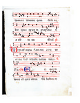
Antiphonal (Gradual?): Number 27
Unknown
The vellum is in poor condition and it has warped. There are stains on the recto which Ege notes may have been from candles when the book was used for Mass. There is some smudging, particularly on the recto.; Several decorated initials, done in a simple style with thin red and black decorative lines.; Italian Gothic Rotunda; It was noted by the University of Saskatoon that the materials used to make this manuscript were not the best available. It was made of sheep skin, which is of lower quality than cow skin. There are also spots on the hair side where the animal's hair had not been removed carefully.; Black, blue, and red inks
-
Breviary: Number 16
Unknown
Vellum is very worn. Ege says that either this book was used frequently or it was buried with the original owner.; On each side there is a decorative flower motif.; Angular Gothic Script; Many historiated initials, done in the same style as those in the Beauvais Missal, but in much less detail because of the size.; Flower motifs in the margins of both the verso and the recto.; The vellum here is from a uterine calf (an unborn calf) which is of higher quality than other vellum. This, along with the small size, shows that it was very expensive when it was made. This leaf is done in incredible detail. Breviaries were service books, and not usually owned by laymen, however, the size of this breviary suggests that it was owned by an individual. The vellum is very worn which Ege suggests is indicative that either it was heavily used by the owner or that it was buried with the owner.; Black, green, blue, red, and gold inks
-
Book of Hours: Number 45
Unknown
Vellum is slightly worn, but Ege notes that this vellum was of high quality.; Particularly beautiful lettering, note the "R" on line 4 of the verso and the "E" on line 7 of the verso. Also several decorated initials in gold with red and blue surrounding it and thin decorations in white ink as a top layer.; Gothic Script; Floral images, brown stems with red, blue and gold leaves done particularly well.; In left margin of verso.; Denison notes that there are many errors in the script of this Book of Hours, this seems strange considering the quality of the vellum and the flowers and the quality of the handwriting.; Brown, red, blue, and gold inks
-
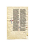
Bible (Song of Songs and Wisdom): Number 11
Unknown
St. Jerome translation of the Bible; There is a small curved cut in the bottom left corner, this seems to be from a defect in the animals skin, it was like this when the manuscript was first made. It suggests that the original patron did not pay a large amount for this book. Besides this, there are many wrinkles, but otherwise it is in very good condition.; Decorative letters in the margins.; Ege calls this "Rotunda Gothic Script," but there are major differences in this manuscript than traditional manuscripts of this form. In particular, the letters are very close to one another, which seems to imply an influence from earlier styles. This should be considered a "Bastard Script" which was used because it was faster to write than other scripts. Commentaries on the text are written in red ink and the text itself is in black.; Ege notes that Italians were less concerned with producing high quality manuscripts than their Northern counterparts, and that is evident here, however, the small print shows that there was a great deal of time and skill that went into this manuscript.; Very simple decorations done in blue and red.; Black, red, and blue inks
-
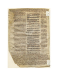
New Testament (Gospel of John): Number 1
Unknown
St. Jerome translation of the Bible; Damage from dirt from frequent use. Still easily legible. The bottom right corner is missing, this is from a defect in the animal's skin, no text is missing, the manuscript has looked like this since it was made. It does suggest that the original patron did not pay a large amount for this book.; Decorative paragraph markings in the commentary of Bede(?).; Font type is referred to by Ege as "Revived Carolingian," while it has Carolingan characters it also has a Gothic influence. The other script also seems to be of this hybrid nature, except for the commentary of Gregory which is significantly different and difficult to determine. It appears less formal and may have been added by an owner of the manuscript.; In addition to the Gospel of John (in the middle) this manuscript provides the commentaries of Bede, Jerome and Gregory. Each commentary is in a different script, Gregory is on bottom, the side commentary is probably Jerome and the marginal commentaries are probably Bede's. However, there is a fifth, more informal handwriting as well, this may have been from one of the owners. Because of the different scripts it may be that each one is from a different time.; Black and brown inks
-
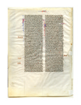
Vulgate Bible: Number 19
Unknown
St. Jerome translation of the Bible; Good condition.; One historiated initial that is particularly well done. Simple "P" in red and blue with thin decorative white ink, however, inside the "P" there is a decorative dog head. There are also several decorated initials with thin filigree that are some of the most impressive in the collection. The page numbers are also more richly decorated than others in the collection.; Transitional Rotunda Script; See "Decoration and Ruling"; Head of a dog.; This section of Proverbs is instructions from King David to his son, Solomon, perhaps the dog is meant to be associated with obedience?; In historiated initial; Some notes on the recto, in the same handwriting as the rest of the document, probably from the original scriptorium.; Black, brown, red, blue, and gold inks
-
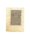
Book of Hours: Number 43
Unknown
Good quality, though vellum is slightly creased.; Many rubricated initials done in a simple style and several historiated initials decorated with thin designs. In this example, the filigree is particularly well done, they actually form three dimensional shapes with shading through cross-hatching. The designs completely fill the letters with almost now blank space.; Bold Angular Gothic Script; Black, blue, red, and purple inks

