

Preview
Creation Date
5th–6th century CE (original); 2009 (facsimile)
Geography
Eastern Mediterranean, perhaps Constantinople
Culture
Roman, Byzantine
Medium
The original is painted on vellum or parchment. The facsimile is color printed on thick paper.
Dimensions
XXIII: 6 1/8 × 8 5/8 in. (15.5 × 21.9 cm)
Credit Line
Purchase by the Department of Art History, 2018
Accession Number
2018.2
Provenance
The facsimile was purchased by the Department of Art History in May 2018 from Giovanni Scorcioni of facsimilefinder.com.
Condition
XXIII: The facsimile page is in not missing any large chunks or exhibit holes. The original, linked here, has a few holes in the bottom right corner and seems to have rows of stitches or some kind of fiber-based repair reaching diagonally from the upper left corner to the bottom right corner. The original is also missing holes along the bottom border that the facsimile is not. The facsimile’s borders are rounded, with slight damage to the right borders. The piece is relatively worn, with faces, bodies, and objects being almost entirely erased by time. There seems to be water damage along the right side, with brown stains leaking into the pictorial forms of the piece. This water damage carries through to the back of the piece, elucidating the extent to which this piece was exposed to water or any other kind of liquid that would have stained in this exact pattern. The writing on the back has bled through to the front. The backside of the facsimile shows the aforementioned seams or fiber repairs, depicting the sewn-together, once-jagged edges of whatever ripping or tearing the original endured. There is a dark brown splotch on the lower right side of the back side of the piece, covering some of the words; the splotch is transparent, however, so the words are visible through the stain.
Elle Sommer (’25), October 2023
Signatures, Inscriptions, and Markings
XXIII: Besides the original markings on the back of the piece, there appear to be red annotations added in Greek. These red annotations hover above the heads of the main pictorial characters. In the scheme of the larger collection, these are relatively minimal annotations, only occupying a small amount of space above each deity pictured. The illustration seems to speak for itself in this manner. The brown numeral in the upper lefthand corner is slightly aged, but not as aged as the original text of the Iliad on the back.
References
Bianchi Bandinelli, Ranuccio. Hellenistic-Byzantine Miniatures of the Iliad (Ilias Ambrosiana). Olten: Urs Graf-Verlag, 1955.
Ilias Picta. Valencia: Ediciones Grial, 2009. [Facsimile edition]
Additional bibliography may be found on the Ambrosian Library's website.
Description
One of three manuscripts that survive from this time period, the Ambrosian Iliad, or Ilias Picta, is most stylistically related to the Vergilius Vaticanus (one of the other surviving manuscripts). The Ambrosian Iliad deals with Homer’s Iliad, and the subsequent transmissions of Hellenistic/pagan traditions, in an era of Late Roman imperialism.
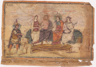
XXIII (Wounded Diomedes before Hera, Zeus, Athena, and Apollo): The corresponding text in the Iliad deals with Book V, the moment in battle in which Diomedes, favored by Athena, wounds Ares who rushes back to Olympus to complain to Zeus. This is a turning point in the narrative of the Trojan War because by the end of the book, no gods at all are involved in the war waged between the Trojans and the Greeks.
The first thing that becomes immediately apparent in this scene is the difference in the figures and their garb depicted on this folio. The dress of the four figures on the sigma is loose, softly draped, ceremonial. Hera, Zeus, Athena, and Apollo (from left to right; or Juno, Jupiter, Minerva, and Apollo, as they are identified by the facsimile’s label, but also known to be gods based on the fact that they aren’t in armor like the rest of the figures in the Ambrosian Iliad) are all clothed in the loose garments, but it is Jupiter and his attire that stand out primarily. Jupiter is the only god upon the sigma whose skin has been either retouched or preserved (a distinction that is hard to make at the moment). His sun-kissed glow, the attention paid to his bare torso, all speak to a care taken by original artisans/illustrators and/or later repair artists. His toga is one of the darkest things on the entire folio, being the same shade as Mars’ draped cape. It immediately stands out as a central line of symmetry in the folio, being almost right on center. The fact that Jupiter, the king of the gods, is not entirely centered is an interesting inversion of expectations that leaves itself up to interpretation. Minerva’s attire also presents an interesting question of depiction. Her toga is composed of the brightest colors in the folio, bright orange layered over rich pink and blue. Her mantle, the war helmet that rests upon her divine head, flares wide behind her, with its central arch reaching up to the top of the folio in the shape of a wishbone. Apollo’s attire seems to almost be in the shades of the vellum, as if the artisan was focusing on other aspects of the scene and decided to merely outline the toga. The last figure on the sigma, Juno, is placed to the right of Jupiter, her body oriented towards him entirely. Her garb seems entirely different compared to that of Jupiter, Minerva, and Apollo. The torso of her toga stretches long, compared to how Minerva’s is shortened by the stretch of blue across her chest. The pink-ish, purple of her main robes pools in her lap, contrasting sharply with the white outer garment that reaches to cover her slightly inclined head. The other gods’ attention is directed sharply at Mars and his outstretched hand, but Juno’s gaze is directed inwards at the other gods, perhaps more focused on Jupiter (who almost seems to be gazing out at the viewer, captivating the attention of the viewer and thus engaging them personally in this folio). The garb of Juno in this regard seems out of place next to the classic Hellenistic drapery of the other gods on the sigma. Her modestly covered head, the outer robe that covers her arms daintily, the extended exposure of her body’s torso to the viewer’s gaze— all blend together to isolate her. In terms of isolation through dress, Mars is also subject to this visual segregation catalyzed by dress. He is in full battle armor, with a mohawk-like horsehair helmet and a wide blue mantle flaring behind him. This mantle looks slightly similar to Minerva’s, tying their war-like presences together. However, the darkness of his armor, the exposure of his calves, the silver of his greaves all set him apart. Not only is he dressed differently, he is placed on an entirely different plane, visually subservient to the gods. He is not on the sigma and he is not in the loungewear-like togas of the Olympians. In this regard, the folio is reinforcing visual hierarchies between the gods themselves as well as warriors versus leaders (who don’t involve themselves in the fight).
The most vibrant parts of the folio, besides the brightness of Minerva’s robes, is the sigma and bench that the gods rest upon. The tan bench is clearly depicted, the most well-maintained object on the entire folio. Above the bench, behind the gods, the teal sigma rests under the gods, stark and naturalistic in its representation of space and of the weight of the gods upon it. The strong preservation of the sigma and bench seem to suggest a preference for visually delineating a cultural and spatial difference between the gods. Not only are they physically elevated above Mars, who seems to be dressed as a soldier (an elite soldier, but a soldier nonetheless), but they are also lounging and laying back, evidenced by the creases and folds of the gods’ weight upon the sigma, while Mars appears in distress, holding a limp arm with a pinched face. How are the gods elevated above all, even other gods who happen to be dressed like mortals? How is this elevation significant to the understanding of religion at the time?
Another interesting thing about the folio is that the number, the identifier that places this folio in conversation with the folios surrounding it, is placed in the upper lefthand corner. Most of the folio numbers are placed in the bottom left hand corner, but it would seem that the choice for placement of folio identifier was intentionally switched so as to preserve the feet of Mars. The delicacy in the depictions of feet is a similar trend throughout the manuscript and subsequent facsimiles which presents an interesting question about the attention to detail of entire bodies in this illuminated manuscript. While the greaves and feet of Mars have been rubbed off or perhaps leached away by water damage, the shadow that his feet and the rest of his body casts is still present. The use of shadows in this folio is intriguing — even though Mars and his status are visibly de-escalated by way of his shortened height, he is still deemed worthy of taking up space, of catching the sunlight. In terms of other things on the border that seem to have been erased by damage, the right hand side of the folio seems to have been the most impacted by the water damage. The top of a vase apparent at the end of the sigma is entirely gone, with perhaps only the foot of the sigma surviving. The width of that empty space is another interesting question. Why leave space empty? Perhaps this was to emphasize the power of the gods within this folio, taking up the entire stretch of vellum with their powerful presence and intriguing depictions.
Elle Sommer (’25)
Keywords
Department of Art History Collection, Before 600 CE, Byzantine Art